
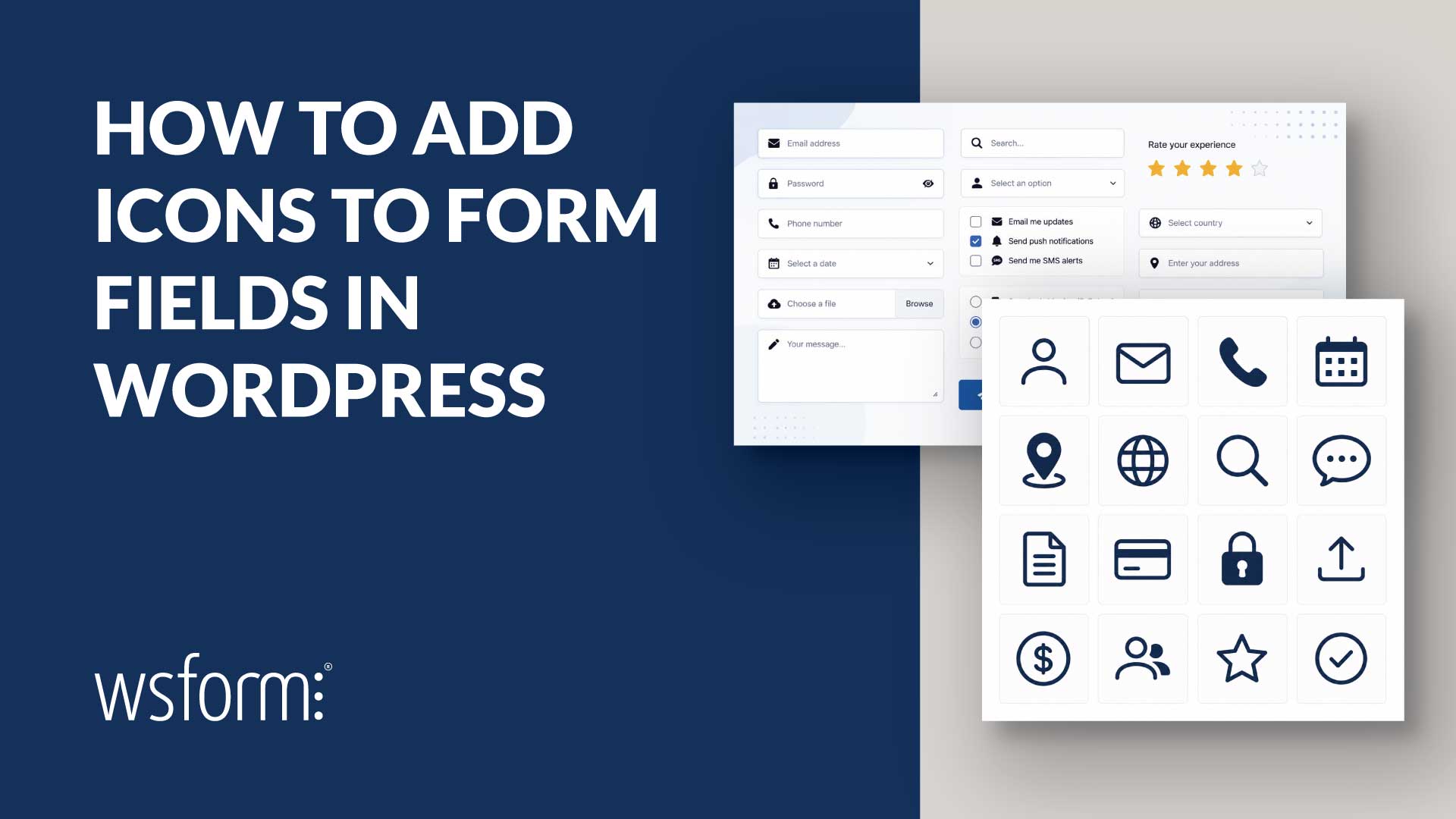
Icons are a simple but effective way to improve the usability of forms for WordPress. They provide visual cues that help users identify fields more quickly, make buttons easier to recognize, and can give your forms a more polished, professional appearance.
Whether you’re building a contact form, quote request, registration form or booking form, adding a few well-chosen icons can improve the overall user experience without making your forms more complex.
Unlike some form builders that provide a built-in icon picker tied to a specific icon library, WS Form lets you use standard HTML anywhere the builder already supports it. That means you can use Font Awesome, Dashicons, inline SVG, images, or your own custom markup.
If you use Font Awesome or Dashicons, make sure that library is enqueued by your theme or another plugin on the front end.
See It in Action
The following demo showcases several common ways to add icons to forms using WS Form.
Why Use Icons?
Icons should never replace good labels, but they can reinforce them.
Some common examples include:
- An envelope beside an email field.
- A phone icon beside a telephone field.
- A paper plane on a Send button.
- Stars for pricing plans.
- Badges or shields for premium options.
Because WS Form uses HTML rather than a fixed icon picker, you’re free to use whichever icon library your project already uses instead of introducing another dependency.
Add Icons to Text Inputs
One of the most common places to use icons is alongside text-based inputs.
Text, Email, URL, Phone, Password, and Number fields all support Prefix and Suffix settings on the Basic tab.
Adding an icon is as simple as pasting your HTML into one of those settings.
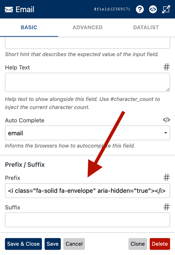
For example, to add an envelope icon before an email field:
<i class="fa-solid fa-envelope" aria-hidden="true"></i>
Or, if your site uses Dashicons:
<span class="dashicons dashicons-email" aria-hidden="true"></span>
A Prefix or Suffix containing only an icon is perfectly valid.
Learn more: Create a Field Prefix or Suffix
Add Icons to Checkbox and Radio Options
Icons also work well for presenting choices.
Whether you’re offering pricing plans, product options, membership levels, or contact preferences, adding icons to Checkbox and Radio labels makes each option easier to distinguish.
Simply add your icon HTML to the mapped Label column in the data grid.
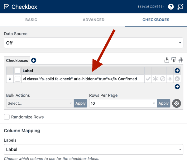
Example:
<i class="fa-solid fa-star" aria-hidden="true"></i> Premium
This technique works with all checkbox and radio layouts, but it looks particularly effective when using Button-style options.
For Button-style checkboxes, see Style Checkboxes.
For Button-style radios, see Style Radios.
Add Icons to Buttons
Buttons are another excellent place to use icons.
A paper plane immediately suggests sending a form, while arrows, floppy disks, and download icons all reinforce common button actions.
Button fields support HTML directly in the Label setting.
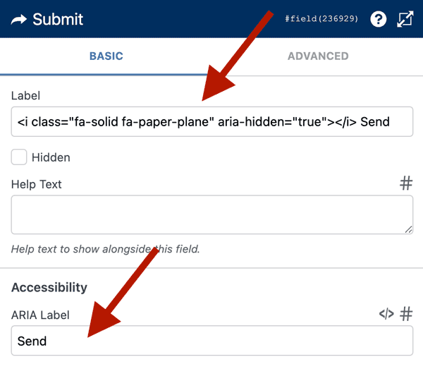
Example:
<i class="fa-solid fa-paper-plane" aria-hidden="true"></i> Send
Icons can appear before or after the button text, depending on your design.
Choose the Icon Format That Fits Your Project
One of the advantages of using HTML rather than an icon picker is that you’re not restricted to a single icon library.
Font Awesome
If your site already uses Font Awesome, simply paste the icon HTML into the appropriate WS Form setting.
<i class="fa-solid fa-envelope" aria-hidden="true"></i>
Dashicons
If you prefer to stay within the WordPress ecosystem, Dashicons are another excellent choice.
<span class="dashicons dashicons-warning" aria-hidden="true"></span>
Inline SVG
Inline SVG provides maximum flexibility without loading an icon font.
<svg xmlns="http://www.w3.org/2000/svg" viewBox="0 0 24 24" aria-hidden="true">
	<path d="..."/>
</svg>
Images
If you already have custom icons, you can use image files instead.
<img src="/path/to/icon.svg" alt="" aria-hidden="true" style="height:1em;width:1em;">
Loading Icon Libraries
WS Form deliberately leaves icon library loading up to your theme or project.
This avoids loading unnecessary assets on sites that don’t need them.
If your icons aren’t appearing, it’s usually because the icon library hasn’t been loaded.
Font Awesome
Follow the installation guide provided by Font Awesome.
If your theme or another plugin already loads it, no additional configuration is required.
Dashicons
Many themes don’t load Dashicons on the front end.
You can enable them by adding the following to your theme’s functions.php file or a code snippets plugin:
add_action('wp_enqueue_scripts', function() {
	wp_enqueue_style('dashicons');
});
Accessibility
Icons should enhance your forms, not replace meaningful labels.
Decorative icons should include aria-hidden="true", while decorative images should use an empty alt="" attribute.
If you’re adding icons to button labels or checkbox and radio labels, ensure the ARIA Label setting contains plain text only and does not include the icon markup.
Visible text should always communicate the action or option, with the icon acting as a visual enhancement rather than the only indicator.
Summary
Rather than locking you into a predefined set of icons, WS Form lets you use the icon system that’s already part of your website.
Whether that’s Font Awesome, Dashicons, inline SVG, images, or your own custom HTML, you can add icons to text inputs, buttons, checkboxes, and radio fields without additional premium integrations or complicated configuration.
The result is a cleaner workflow, more flexibility, and forms that integrate naturally with the rest of your site’s design.