The Password field provides a way for the user to securely enter a password. The element is presented as a one-line plain text editor control in which the text is obscured so that it cannot be read, which is done usually by replacing each character with a symbol, such as the asterisk (“*”) or a dot (“•”). This character will vary depending on the user agent and OS.
Demo
Adding a Password Field
To learn how to add, edit, clone, move, resize, offset, or delete a password field, please click here.
Field Settings
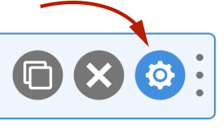
To edit the settings for this field type, click the settings icon on the field itself. Click the Save & Close or Save button to save your changes. If you do not want to save your changes, you can click the Cancel button or click any other form element to close the field settings sidebar.
Basic
The basic tab contains settings that the majority of WS Form users will need to control a field. The settings are as follows:
Label
This is the label shown alongside the field. As well as entering a label into this field, you can also double click the label of the field in the editor. You should enter an easy-to-understand label for your field, for example, First Name or Email.
Show Label
If enabled the label will be shown on your form. If you do not want the label to appear for a particular field, uncheck this box.
Required
If checked this field will be required when the website visitor completes your form. Failure to complete the field if this is checked will result in a validation message appearing under the field prompting the user to complete the field correctly.
Required fields are indicated on your website with the word Required being adding to the label of the field. This can be changed in the form settings advanced tab.
Hidden
If checked the field will be hidden on the form. It can be shown again using conditional logic or your own JavaScript.
Default Value
The default value setting is used to populate the field with some default content. Unlike the placeholder text, default values are stored when the form is saved or submitted.
WS Form variables can be entered into this field.
Placeholder
Field placeholders are used to place text in a field prior to the website visitor completing the field. The web browser then removes the placeholder text when text is entered into the field. Placeholder text is typically used to provide an example of what should be entered into that field such as ********** for a password field. If this field is left blank, a placeholder will not be added to the field.
Placeholder text is not stored when the form is saved or submitted.
WS Form variables can be entered into this field.
Help Text
The help text setting enables you to add smaller text under the field to assist the website visitor in completing that field.
As well as inserting plain text into this field, WS Form also provides extensive functionality for adding character and word count information. Click here to learn more about this functionality.
WS Form variables can be entered into this field.
Auto Complete
Web browsers sometimes have features for helping users fill forms in, for example pre-filling the user’s address based on earlier user input. The autocomplete content attribute can be used to hint to the web browser how to, or indeed whether to, provide such a feature.
Use this setting if you would like to specify the value of the autocomplete attribute. Use the off option to prevent auto complete on the field.
Features
Password Strength Meter
If you enable this feature, the password field will show how strong a password is as the password is being typed.
Minimum Password Strength
Choose a minimum password strength for the password field. If the chosen level is not attained the field will be invalidated. Password strength levels are handled ZXCVBN which is bundled with WordPress.
Password Visibility Toggle
If you enable this feature, a password visibility toggle icon will appear in the password field. When clicked, the obscured password will be shown as plain text. When clicked again, the plain text password will be obscured again.
Suggest Password
If you enable this feature, a suggest password icon will appear that will generate a random password for the user.
Prefix / Suffix
The prefix and suffix settings allow you to add a prefix box and/or suffix box to the field.

For example, you could add a unit of measure as a suffix, or an @ symbol as a prefix.
Accessibility
ARIA Label
Accessible Rich Internet Applications (ARIA) defines ways to make web content and web applications more accessible to people with disabilities.
This setting enables you to define what text is made available to ARIA applications. This would, for example, provide a screen reader with specific text to read to someone with a disability.
The value of this setting defaults to your field label. If you would like to change this, enter a new value.
WS Form variables can be entered into this field.
Advanced
The advanced tab contains additional form attribute settings that provide further control over how a field is rendered.
Styles
Use the Styles settings to change the design of the password field.
Label Position
There are five positions you can choose from for your label:
- Default
- Top
- Left
- Right
- Bottom
The default position will place the label set in the form settings advanced tab. For new forms this will be the Top positioning.
Note that when using some frameworks some label positions may not be available.
Label Width
If your label position is set to left or right, you can specify how wide the label will be. You can consider the overall width of the label and the field to be 12 columns (or whatever value is set in Form Settings). By default, labels are rendered at 3 columns wide (1/4 width), which means the field itself is 9 columns wide (3/4 width). You can change the width of the label using this setting.
To change the default width of all labels in your form:
1. Click the form settings icon.
2. Click the Advanced tab.
3. Scroll down to Default Label Width and change the setting.
4. Click Save at the bottom.
Vertical Alignment
The vertical alignment option allows you to choose how this field will be vertically aligned in relation to fields in the same row. The options are:
- Top
- Middle
- Bottom
Classes
For developers WS Form allows you to add your own classes to fields.
Field Wrapper
The wrapper CSS class setting enables you to add a class (or classes) to a field wrapper. Field wrappers are sections of HTML added around a field to position them on the page. To add multiple classes, add a space between the class names.
Field
To add a class to the actual field element itself, enter a class (or classes) to this setting. To add multiple classes, add a space between the class names.
Restrictions
Field restrictions enable you to define what can or cannot be entered into the field.
Disabled
If checked the field will be disabled, and it cannot be interacted with. You can re-enable a field dynamically by using conditional logic.
Read Only
If checked the field will be read only. Read-only forms provide a way of showing a value in a field without giving the website visitor the opportunity to change the value.
Auto Complete Off
If checked, the form will attempt to not allow the visitor’s browser to autofill this field.
Minimum Character Length
This is the minimum number of characters that need to be entered into the field in order for it to be valid. Leaving this blank will set the minimum character length to zero. If the field is submitted without the minimum character length defined, a validation error will appear under the field.
This number can be used in conjunction with the character count variables.
Maximum Character Length
This is the maximum number of characters that can to be entered into the field in order for it to be valid. Leaving this blank will set the maximum character length to infinity. If the field is submitted with more than the maximum character length defined, a validation error will appear under the field. Typing will typically be limited to this number of characters.
This number can be used in conjunction with the character count variables.
Pattern
This advanced field enables you to set the pattern attribute on a field. The pattern attribute specifies a regular expression that the <input> element’s value is checked against. This field is useful in, for example, forcing a website visitor to enter an alphanumeric password.
Example patterns can be selected by clicking the hamburger icon .
User Status
Choose from one of the options to filter which user status can see this field:
- Any
- Is Logged In
- Is Logged Out
- Has User Role or Capability
If you choose Has User Role or Capability, additional settings will appear that enable you to choose one or more roles or capabilities.
Labels
Use these settings to change the labels used for the password strengths as well as the visibility toggle icon title.
Validation
Show Invalid Feedback
Invalid feedback text is shown when a form is saved or submitted, and the field has not been completed according to the field settings you have configured. For example if the minimum character count is 10 and you enter 5 characters and then submit the form, the field will be deemed invalid. If this setting is checked, invalid feedback is shown under the field.
Invalid Feedback Text
WS Form automatically builds invalid feedback text for all of your fields. If no text is entered into this field, the value shown in the field in light gray text will be shown. If you would like to specify alternative invalid feedback text, you can enter it within this setting.
WS Form variables can be entered into this field.
Custom Attributes
This setting is used to add custom attributes to the HTML of this field, such as data-my-attribute="1234". You can add as many custom attributes as you need.
To add a custom attributes key value pair:
- Click the Add icon to add a custom attribute row.
- Enter the key in the left column.
- Enter the value in the right column.
- Click Save to save the custom attributes.
Breakpoints
The breakpoint settings define the width of a field and also what the offset (how many columns from the left-hand side of the form or the previous field) of a field is for each breakpoint. For more information about the breakpoint settings and capabilities of WS Form, click here.