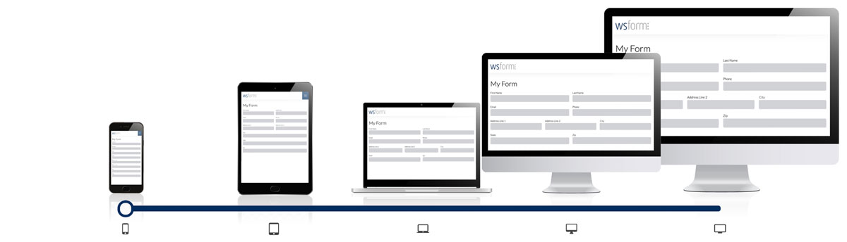
The word Responsive, in the context of web development, means that the web page dynamically adjusts its layout to suit the screen size of the device it is being displayed on. Responsive design is vital for online forms, as incorrect scaling on the front end can make it difficult to interact with certain form elements. If you’ve ever tried filling in a contact form on a phone where the form labels were so small you couldn’t see which field was which, you know what we’re talking about.
So, for example, on a mobile device, full-width inline form input fields are larger and easier to interact with on smaller screens, whereas on a desktop computer with a larger screen, you might want to split your fields across 2 or more columns.
Similarly, users interact differently with checkbox, select, and submit button fields depending on whether they’re using a touchscreen or a mouse cursor.
Responsive forms improve the accessibility of your forms.
In this tutorial, we’ll look at the ins and outs of responsive forms. WS Form PRO allows you to quickly build fully responsive forms for any input type using the drag and drop form builder interface – absolutely no CSS styling, Javascript, or HTML knowledge required!
Breakpoints
In a responsive form, a breakpoint is a point (screen width) at which the form will adapt in a certain way in order to provide the best possible user experience. These are approximately the width of a screen you would find on different devices such as a phone, tablet, laptop, or desktop computer.
Example breakpoints might be:
- Extra small – Up to 575 pixels width (mobile device)
- Small – Up to 767 pixels with (tablet)
- Medium – Up to 991 pixels (laptop)
- Large – Up 1199 pixels (desktop)
- Extra large – 1200 pixels or more
How To Choose a Breakpoint
When editing a form in WS Form PRO, you can select the breakpoint you wish to edit by using the slider at the bottom of the screen.

You can either click a breakpoint to view it, or click and drag to see various breakpoints. If you hover your mouse over a breakpoint icon, it will show you the breakpoint attributes, such as the minimum size the screen has to be to trigger that breakpoint.
The width and offset of sections and fields can be changed per breakpoint. Tabs, sections, and fields are ordered the same regardless of the breakpoint you select. The settings of sections and form fields also remain the same for every breakpoint too. For example, this means if you change the label of a field when at the smallest breakpoint, it will have exactly the label at the largest breakpoint.
Widths
Each field and section on your form can be a different width. The width of a field or section is measured in columns. The max width available is 12 columns. So, for example, to make a field half width, you would set it to 6 columns.

If space allows, fields will stack next to each other in a given row. For example, if you had two fields that were 6 columns each, they would sit next to each other in the same row.
If you need a field to start at the beginning of a row, consider adding a new section.
Offsets
In addition to width, you can also offset fields and sections. The amount of offset is again measured in columns.

You can only offset fields that are less than 12 columns in width.
How to Change Field Sizes & Offsets
To change the size of a field, click and drag the resizer icon. To change the offset of a field, click and drag the offset bar.

How to Change Section Sizes & Offsets
To change the size of a section, click and drag the resizer icon. To change the offset of a section, click and drag the offset bar.

To change the offset of a field or section, click and drag the thicker edge.
Inheritance
When you change the size of a field, any breakpoints above that will inherit that same size unless you set a specific size for that field at a higher breakpoint. Likewise, the same occurs with offsets. This applies to sections also.
In other words, if you set a width at the extra-small breakpoint, it will be inherited by the small, medium, large, and extra-large breakpoints, unless you specifically set a custom width or offset at those breakpoints.
Best Practice
Best practice when building a form would be to design a single-column style form at the mobile breakpoint. Then when you have finished making your form, click to the next breakpoint up and introduce some columns that would make viewing the form easier at that width. Progressively work your way up to desktop width, where you might have two, three, or four columns of fields.
Reset
The reset button clears all of your widths and offsets and returns your form to a single-column format. If you reset your form in error, you can use the undo tool to revert your form back to its prior state.
Section and Field Settings
As well as using the slider to select a breakpoint, you can also set the breakpoint widths and offsets when editing a section or field using the sidebar menu. Click on the Advanced tab and scroll to the bottom to find the breakpoint width and offset column editor. This provides you with a granular editor for the column width and offset for any section or field in your form.
Click the Save button to save your changes, or click Cancel to ignore your changes.
Conversational Forms
Conversational forms are a way of presenting form questions one-by-one instead of showing the entire form at once. This makes completing the form easier, improving conversion rates and user satisfaction. They are presented as a full-screen form, allowing for larger, easier-to read-fields.
Conversational Forms are a template offered with WS Form Pro, and you can read more about them here.
For Developers
We also support different frameworks such as Bootstrap and Foundation for developers. These frameworks have different breakpoints and we show those in the layout editor. The default framework, WS Form, has 5 breakpoints. You can change the framework WS Form is using in global settings.
The breakpoint sizes can also be changed by using the wsf_config_frameworks filter hook. Learn more.
WS Form PRO automatically optimizes field and section framework classes.