The Checkbox field creates one or more square boxes on your form that can be checked.
Demo
Adding a Checkbox Field
To learn how to add, edit, clone, move, resize, offset, or delete a checkbox field, please click here.
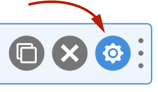
Field Settings
To edit the settings for this field type, click the settings icon on the field itself. Click the Save & Close or Save button to save your changes. If you do not want to save your changes, you can click the Cancel button or click any other form element to close the field settings sidebar.
Basic
The basic tab contains settings that the majority of WS Form users will need to control a field. The settings are as follows:
Label
This is the label shown alongside the field. As well as entering a label into this field, you can also double click the label of the field in the editor. You should enter an easy-to-understand label for your field, for example, First Name or Email.
Show Label
If enabled the label will be shown on your form. If you do not want the label to appear for a particular field, uncheck this box.
Hidden
If checked the field will be hidden on the form. It can be shown again using conditional logic or your own JavaScript.
Enable Select All
When enabled, WS Form will show a Select All checkbox above the first checkbox. This enables users to select or deselect all checkboxes in a single click.
Default Value
If a value is entered into this setting, the checkbox containing that value will be checked by default. Note that this value needs to be the checkbox value not the text shown for the checkbox.
Comma separated values can be entered into this setting. Values will be trimmed.
Other ways of setting the default value, include:
- Select rows in the Checkboxes tab using the Selected icon. Learn more
- Set the default value using PHP. Learn more
- Use the WordPress Filter Hook Data Source. Learn more
Help Text
The help text setting enables you to add smaller text under the field to assist the website visitor in completing that field.
As well as inserting plain text into this field, WS Form also provides extensive functionality for adding character and word count information. Click here to learn more about this functionality.
WS Form variables can be entered into this field.
Layout
Orientation
Checkboxes can either be oriented in a vertical, horizontal or grid format. Use this setting to determine which orientation you would like the checkboxes to appear in.
If you select Grid, you can set a width for each checkbox at each breakpoint. If you only change the smallest breakpoint, all of the other breakpoints will inherit that width too. This enables you to create multi-column layouts if you have more than one checkbox in your field.
To learn more about responsive form design, click here.
Accessibility
ARIA Label
Accessible Rich Internet Applications (ARIA) defines ways to make web content and web applications more accessible to people with disabilities.
This setting enables you to define what text is made available to ARIA applications. This would, for example, provide a screen reader with specific text to read to someone with a disability.
The value of this setting defaults to your field label. If you would like to change this, enter a new value.
WS Form variables can be entered into this field.
Exclusions
Exclude From Emails
By default, WS Form uses the #email_submission variable in email templates. This provides a simple way of displaying all of the submitted fields in emails. Sometimes there might be a need to exclude a field from an email, for example, you might want to not include some introductory copy on a form, or hide a field you’re using with conditional logic to show or hide an element.
To hide a field from emails, check this box.
Other WS Form add-ons may add exclusions in this section too, such as the WooCommerce add-on which allows you to exclude certain fields from the cart entries.
Hidden Behavior
Always Include in Actions
This setting allows you to change the behavior of a field if the hidden setting is checked (See above), or if you set a field as hidden using conditional logic.
The normal behavior for a field that has been hidden is that it will not be included if an action has a Clear Hidden Fields setting enabled. For example, if you have a Send Email action, WS Form will not include fields that are hidden.
If this setting is checked, this field will always be included in actions if it is hidden.
Advanced
The advanced tab contains additional form attribute settings that provide further control over how a field is rendered.
Styles
Use the Styles settings to change the design of the checkbox field.
Label Position
There are five positions you can choose from for your label:
- Default
- Top
- Left
- Right
- Bottom
The default position will place the label set in the form settings advanced tab. For new forms this will be the Top positioning.
Note that when using some frameworks some label positions may not be available.
Label Width
If your label position is set to left or right, you can specify how wide the label will be. You can consider the overall width of the label and the field to be 12 columns (or whatever value is set in Form Settings). By default, labels are rendered at 3 columns wide (1/4 width), which means the field itself is 9 columns wide (3/4 width). You can change the width of the label using this setting.
To change the default width of all labels in your form:
1. Click the form settings icon.
2. Click the Advanced tab.
3. Scroll down to Default Label Width and change the setting.
4. Click Save at the bottom.
Vertical Alignment
The vertical alignment option allows you to choose how this field will be vertically aligned in relation to fields in the same row. The options are:
- Top
- Middle
- Bottom
Classes
For developers WS Form allows you to add your own classes to fields.
Field Wrapper
The wrapper CSS class setting enables you to add a class (or classes) to a field wrapper. Field wrappers are sections of HTML added around a field to position them on the page. To add multiple classes, add a space between the class names.
Field
To add a class to the actual field element itself, enter a class (or classes) to this setting. To add multiple classes, add a space between the class names.
Restrictions
Minimum Checked
Enter a number in this setting to determine the minimum number of checkboxes that should be checked in order for this field to validate.
Maximum Checked
Enter a number in this setting to determine the maximum number of checkboxes that can be checked in order for this field to validate.
Note that this option is not available if Enable Select All is checked.
User Status
Choose from one of the options to filter which user status can see this field:
- Any
- Is Logged In
- Is Logged Out
- Has User Role or Capability
If you choose Has User Role or Capability, additional settings will appear that enable you to choose one or more roles or capabilities.
Duplicates
No Duplicates in Repeatable Sections
This setting only applies to checkbox fields that are within a repeatable section. It prevents the same checkbox from being checked across multiple repeatable section rows. For example, if you had a checkbox field with t-shirt sizes and selected Small in the first row, then the Small checkbox will be disabled in all other rows.
Validation
Show Invalid Feedback
Invalid feedback text is shown when a form is saved or submitted, and the field has not been completed according to the field settings you have configured. For example if the minimum character count is 10 and you enter 5 characters and then submit the form, the field will be deemed invalid. If this setting is checked, invalid feedback is shown under the field.
Invalid Feedback Text
WS Form automatically builds invalid feedback text for all of your fields. If no text is entered into this field, the value shown in the field in light gray text will be shown. If you would like to specify alternative invalid feedback text, you can enter it within this setting.
WS Form variables can be entered into this field.
Breakpoints
The breakpoint settings define the width of a field and also what the offset (how many columns from the left-hand side of the form or the previous field) of a field is for each breakpoint. For more information about the breakpoint settings and capabilities of WS Form, click here.
Checkboxes
Each checkbox is configured in this tab. Checkboxes are added using the data grid feature of WS Form. Data grids make entering lists of information quick and easy.
Using the data grid, you can mark a checkbox as selected, required, disabled, or hidden. You can also wrap checkboxes in a fieldset which groups the checkboxes together. That fieldset can then be disabled.
For more information about using WS Form data grids, click here.
Column Mapping
Label
Choose the column in your data grid that contains the labels to be shown to the user when they are viewing your form.
Value
Choose the column in your data grid that contains unique values to used. This is the value that is saved to the submission.
Action Variables
Choose the column in your data grid that is used when you use variables such as #field or #email_submission when used in actions (e.g. Send Email).
Cascading
Cascading allows you to filter the checkboxes shown by using the value of another field on your form. An example application of this feature would be to filter a list of checkboxes for vehicle models by another field containing vehicle makes.
Cascade
Check this setting to enable the cascading feature on this field.
Filter Column
The filter column setting allows you to choose which column of your data grid you want your checkboxes to be filtered by. In most cases you will want to create a new column that contains values you want to filter by.
Filter Value
The filter value setting allows you to choose which field on your form to filter your checkboxes by in the filter column.
The following field types can be used for the filter value:
- Text
- Number
- Range Slider
- Rating
- Select
- Checkbox
- Radio
- Price Select
- Price Checkbox
- Price Radio
- Price Range
WS Form uses the Value column mapping of select, checkbox and radio fields for the filter value.
You should ensure that the value(s) returned by the Filter Value field match the values in your Filter Column exactly (Case sensitive).
Show All If No Results
Enable this setting if you want WS Form to show all available results if no matching results are found.