Data grids allow you to set up the options shown in Select, Checkbox and Radio fields.
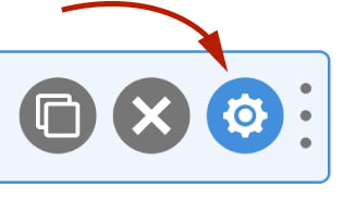
To access the data grid, field click the settings icon on a field.
On a select field you access the data grid by clicking the Options tab. On a checkbox field it is called Checkboxes and on a radio field the tab is called Radios.

An example of a data grid would be a list of countries or states. A more advanced data grid might be a table containing country abbreviations, full names, and ISO codes.
A data grid for a checkbox and the corresponding output is shown below:

Data grids can be easily populated by:
- Manually entering data in a spreadsheet like interface.
- Using one of our many presets (e.g. Country and state lists).
- Pulling data from external data sources such as Posts, Users, Terms or even Advanced Custom Fields.
Editing a Data Grid
To access the data grid, first click the settings icon on a Select, Checkbox or Radio field. You’ll then find the data grid under:
- Options tab for Select fields
- Checkboxes tab for Checkbox fields
- Radios tab for Radio fields
Tip: Click the expand icon (top right) to make the data grid editor the full width of the page.

The data grid editor is made up of the following components:
Data Source
At the top of the data grid is the Data Source setting. When this is set to Off you can manually edit the data grid much like you would a spreadsheet.
Data sources allow you to pull data into your data grid automatically. You can import preset lists such as country or state names. You can also import data from Post, User, Term and from third party plugins such as Advanced Custom Fields.
To learn more about the other available data sources, click here.
Groups
Data grids can have one or many groups. Groups are much like a sheet in a spreadsheet. Groups are used, for example, to group pulldown options into logical sets.

If your data grid only needs one logical list of data, e.g. a list of states or countries, you can stick to just one group. Note that some types of data grids are restricted to one group.
To add a group, click the add icon.
To delete a group, click the delete icon, while hovering over the group tab.
To rename a group, click on the settings icon, then enter a new label for the group.
You can also reorder groups by clicking and dragging them.
All groups have the same columns.
Columns
Data grid columns in a data grid enable you to introduce new dimensions to your data. For example if you needed to store a state abbreviation in your form submission but display the full state name in your form to the website visitor, you would use two columns: State Abbreviation and State Full Name. You would then select the State Abbreviation as the value and the State Full Name as the label.

To add a column, click the add icon at the top right of the data grid table.
To delete a column, click the delete icon while hovering over the column name.
To rename a column, double click on the column heading, then enter a new label for the column.
Rows
Each data grid record is represented as a row in the data grid table.
To add a row, click the add icon at the bottom right of the data grid table.
To delete a row, click the delete icon in the rightmost column of the row you wish to delete.
Data
To edit the data in a data grid, simply click on a cell in a particular column and row and edit the value, much like you would in a spreadsheet. Pressing Return or clicking away from the cell will save it.
You can add HTML to cells too.
Inserting Images
When you hover over a cell, the Insert Image icon will appear. Click on the icon to open the WordPress Select image modal. Select an image and then click Use this image. WS Form will then insert the HTML for that image in your cell.
Row Settings
Each row will have various settings you can enable or disable. These settings are shown on the rightmost side of the data grid row.

Hover over the squares to see the available options. Different types of field will offer one of the four settings.
Selected
This is the default selected row for the field type. For example this might be the default option that is shown in a select pulldown. If no rows are selected, the top row will be selected by default. Some field types allow you to select multiple selected rows by default.
Required
Checkboxes and radios only. This will set the row to required. This means that the website visitor must check or select that row in order for the field to be valid. This is useful, for example, when you want to have a privacy policy or terms of use checkbox.
Disabled
This will disable a row. For a select pulldown, this will typically show the row in light gray. For checkboxes and radio buttons, the input will be grayed out. Website visitors will be unable to select that row if the disabled setting is enabled.
Hidden
This setting lets you hide a row completely from the form. This is useful if you want to temporarily hide a row and then show it at a later date.
Bulk Actions
As well as deleting and changing settings at a row level, you can also bulk change or delete rows using the bulk action tool.

Select the rows you want to affect by checking the boxes in the leftmost column of the data grid. This will activate the bulk actions pulldown from which you can choose:
- Set default
- Set not default
- Set required (Checkboxes and radios only)
- Set not required (Checkboxes and radios only)
- Set disabled
- Set not disabled
- Set hidden
- Set not hidden
- Delete
Click Apply to apply the bulk action.
Rows Per Page
You can select how many rows are shown per page using this option. Select a number from the pulldown, then click the Apply button.
Settings
The settings icon opens up further settings for the current group you are on.
Label
Use this to edit the label of the group you are currently editing.
Wrap in Optgroup (Select Fields)
For select fields you can wrap the options created from your data grid in an optgroup. An optgroup enables you to add groups of options in a pulldown. An example of using this might be to split countries into continents. If this is enabled, you have the option of disabling an entire optgroup much like you could an individual row.
Auto Group By
This powerful feature enables you to automatically create data grid groups by selecting a particular column of your data grid.
Below we use the example of counties and continents to demonstrate this:
Assume you had two columns. The first column is called Continents. The second column is Countries. The first column would contain repetitions of the continents for each row containing a country in that continent.
By selecting Continents under the Auto Group By pulldown, WS Form will split up the rows into separate groups. Each group will contain the countries for each continent. You can then enable the Wrap in Optgroup feature to create an easy-to-use select pulldown that is logically grouped into continents.
Export
You can export any of the groups by clicking the Export icon. This will download the current group in CSV format. The CSV file also contains columns for the row settings (see above).
Import
You can import any CSV file into a data grid. This is useful for importing data such as a country or state list.
To import a CSV file, either click the Import icon or drag a CSV file into the data grid area. When you drag the file into the data grid area a blue box will appear with a dashed outline. Release the file into that area and the CSV import will being.
Note that when you import a file, all data in that data grid will be replaced with the CSV you import.
For sample CSV files that can be imported into a data grid, click here.
Column Mapping
Depending on the field type you are editing, you will typically find a series of pulldowns below the data grid editor that enable you to select which column to use for a particular element of that field.
For example select pulldowns have a label and value. The label is what is shown to the website visitor. The value is what is ultimately stored in the form submission. You can set the label and value to the same column if you wish, or choose two different columns for the value and label.
Learn more: Data Grid Column Mapping