
WS Form is compatible with Font Awesome, Dashicons, inline SVG, images, and any other icon markup your website supports.
WS Form does not include a dedicated icon picker, and that’s intentional. Instead of limiting you to a fixed icon set, WS Form lets you add standard HTML into existing builder settings. This means you can use the icon library or markup that best suits your site.
If you use Font Awesome or Dashicons, make sure that library is enqueued by your theme or another plugin on the front end.
Demo
Text-Like Inputs
Text-like fields such as Text, Email, URL, Phone, Password, and Number support Prefix and Suffix settings in the Basic tab.
To add an icon:
- Click the settings icon on the field.
- In the Basic tab, add your icon HTML directly into Prefix or Suffix setting.
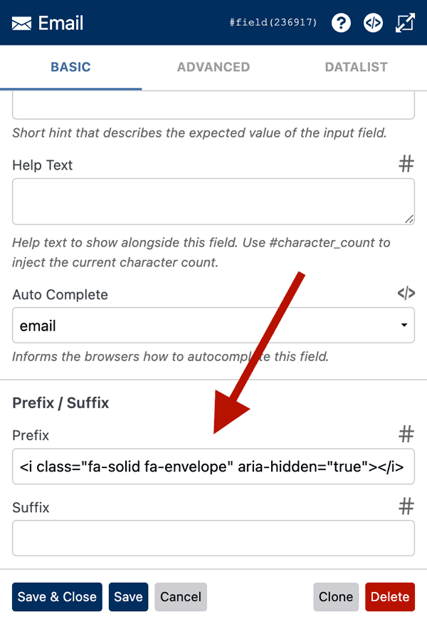
- Click Save & Close.
Example using Font Awesome:
<i class="fa-solid fa-envelope" aria-hidden="true"></i>
Example using Dashicons:
<span class="dashicons dashicons-email" aria-hidden="true"></span>
A Prefix or Suffix containing only an icon is valid.
Prefix and Suffix use WS Form’s built-in input group styling. If you want the icon positioned inside the input border instead, see the Custom CSS section below.
Learn more: Create a Field Prefix or Suffix
Checkbox and Radio Labels
Checkbox and Radio fields support HTML in their option labels.
To add an icon:
- Click the settings icon on the field.
- Click the Checkboxes or Radios tab.
- Add your icon HTML directly to the column you have mapped for Labels.
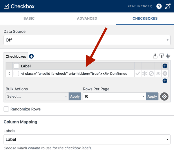
- Adjust the ARIA Label setting to be text only.
- Click Save & Close.
Example:
<i class="fa-solid fa-star" aria-hidden="true"></i> Premium
This works with standard checkbox and radio layouts, but it is especially useful when using Button-style options.
For Button-style checkboxes, see Style Checkboxes.
For Button-style radios, see Style Radios.
Buttons
Button fields support HTML in the Label setting.
This applies to button field types such as Save and Reset, as well as other WS Form button fields.
To add an icon:
- Click the settings icon on the field.
- In the Basic tab, add your icon HTML directly into the Label setting.
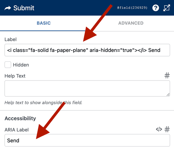
- Adjust the ARIA Label setting to be text only.
- Click Save & Close.
Example:
<i class="fa-solid fa-paper-plane" aria-hidden="true"></i> Send
You can place the icon before or after the button text.
Icon Markup Examples
Font Awesome
<i class="fa-solid fa-envelope" aria-hidden="true"></i>
Dashicons
<span class="dashicons dashicons-warning" aria-hidden="true"></span>
Inline SVG
Inline SVG works without loading a separate icon library.
<svg xmlns="http://www.w3.org/2000/svg" viewBox="0 0 24 24" aria-hidden="true"> <path d="..."/> </svg>
Image
<img src="/path/to/icon.svg" alt="" aria-hidden="true" style="height:1em;width:1em;">
Using 1em helps the icon match the size of the surrounding text.
Loading Icon Libraries
WS Form does not enqueue Font Awesome or Dashicons for you.
If your icons do not appear, check whether the icon library is loaded on the front end of your site.
Enqueue Font Awesome
The recommended way to load Font Awesome is to follow the installation instructions provided by Font Awesome.
If you are already loading Font Awesome through your theme or another plugin, you do not need to load it again.
Enqueue Dashicons
Dashicons are included with WordPress, but many themes do not load them on the front end.
Add this to your theme’s functions.php file or code snippet plugin:
add_action('wp_enqueue_scripts', function() {
    wp_enqueue_style('dashicons');
});
Accessibility
Decorative icons should include: aria-hidden="true"
Decorative images should also use an empty alt attribute: alt=""
Do not rely on an icon alone to communicate important information. Use visible text where the meaning is important.
Ensure the ARIA Label setting is text only and does not include the icon markup.