The Google Map field enables you to add one or more interactive maps to your form. The form user clicks on the map and the latitude and longitude of the map is stored in the submission.
Demo
Setup
The Google Map field requires:
- A Google Cloud Project set up with billing enabled. (Create a Google Cloud Project).
- The following APIs enabled on the Google Cloud Project (Enabling an API in your Google Cloud Project)
- Maps JavaScript API
- Places API (New)
- Geocoding API
- An API key (Create Access Credentials)
To enter your key into WS Form:
- Click Settings from the WS Form admin menu.
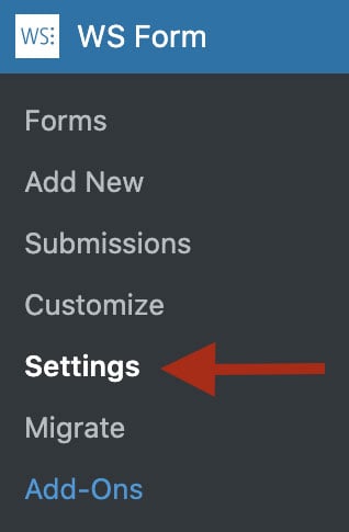
- Click the Advanced tab.
- Enter your API key into the API Key setting under Google.
- Click Save.
Once the key has been added and saved you can add the Google Map field to your form.
Adding a Google Map Field
To learn how to add, edit, clone, move, resize, offset, or delete a Google Map field, please click here.
Field Settings
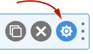
To edit the settings for this field type, click the settings icon on the field itself. Click the Save & Close or Save button to save your changes. If you do not want to save your changes, you can click the Cancel button or click any other form element to close the field settings sidebar.
Basic
The basic tab contains settings that the majority of WS Form users will need to control a field. The settings are as follows:
Label
This is the label shown alongside the field. As well as entering a label into this field, you can also double click the label of the field in the editor. You should enter an easy-to-understand label for your field, for example ‘First Name’ or ‘Email’.
Show Label
If enabled the label will be shown on your form. If you do not want the label to appear for a particular field, uncheck this box.
Required
If checked, the Google Map field must be clicked on by the user.
Hidden
If checked the field will be hidden on the form. It can be shown again using conditional logic or your own JavaScript.
Help Text
The help text setting enables you to add smaller text under the field to assist the website visitor in completing that field.
WS Form variables can be entered into this field.
Map
Auto Center
The auto center setting can be used to automatically center the map to the users location. To enable this feature, choose one of the geolocation methods:
- Browser Geolocation (Uses the location provided by the browser. More accurate but user is prompted to allow location sharing).
- IP Geolocation (Less accurate. User is not prompted).
Both methods are processed client-side, no data is passed to the server to provide this functionality.
Latitude
Enter the default latitude for the map. This setting is used to position the map but does not set the position set by the user. It must be used in conjunction with the longitude setting.
Longitude
Enter the default longitude for the map. This setting is used to position the map but does not set the position set by the user. This setting must be used in conjunction with the latitude setting.
Zoom
Enter the default zoom level for the map. If you do not enter a value in this setting, it will be set to 14. This value typically ranges from 1 – 20 but some areas of the world allow for higher zoom levels.
Type
There are four different types of map you can choose from:
- Road Map
- Satellite
- Hybrid (A combination of road map and satellite)
- Terrain
Use this setting to choose the type of map you want to display.
Search Field
It is possible to use a field such as a text field as an address search field. The address search field can be used to enter a zip or full address to find a location on the map. Simply add a text field to your form (e.g. above the map) and then use this setting to select that field.
Controls
Map Type
Enable or disable the map type control on the map.
Full Screen
Enable or disable the full screen control on the map.
Street View
Enable or disable the street view control on the map.
Zoom
Enable or disable the zoom control on the map.
Marker
The marker indicates where the user has clicked on the map.
Icon Title
Enter the title for the marker, e.g. ‘Selected location’.
Icon URL
Enter a URL or a base 64 encoded data string into this setting to change the marker icon.
Accessibility
ARIA Label
Accessible Rich Internet Applications (ARIA) defines ways to make web content and web applications more accessible to people with disabilities.
This setting enables you to define what text is made available to ARIA applications. This would, for example, provide a screen reader with specific text to read to someone with a disability.
The value of this setting defaults to your field label. If you would like to change this, enter a new value.
WS Form variables can be entered into this field.
Exclusions
Exclude From Emails
By default, WS Form uses the #email_submission variable in email templates. This provides a simple way of displaying all of the submitted fields in emails. Sometimes there might be a need to exclude a field from an email, for example, you might want to not include some introductory copy on a form, or hide a field you’re using with conditional logic to show or hide an element.
To hide a field from emails, check this box.
Other WS Form add-ons may add exclusions in this section too, such as the WooCommerce add-on which allows you to exclude certain fields from the cart entries.
Hidden Behavior
Always Include in Actions
This setting allows you to change the behavior of a field if the hidden setting is checked (See above), or if you set a field as hidden using conditional logic.
The normal behavior for a field that has been hidden is that it will not be included if an action has a ‘Clear Hidden Fields’ setting enabled. For example, if you have a ‘Send Email‘ action, WS Form will not include fields that are hidden.
If this setting is checked, this field will always be included in actions if it is hidden.
Advanced
The advanced tab contains additional form attribute settings that provide further control over how a field is rendered.
Styles
Use the ‘Styles’ settings to change the design of the Google Map field.
Label Position
There are five positions you can choose from for your label:
- Default
- Top
- Left
- Right
- Bottom
The default position will place the label set in the form settings advanced tab. For new forms this will be the ‘Top’ positioning.
Note that when using some frameworks some label positions may not be available.
Label Width
If your label position is set to left or right, you can specify how wide the label will be. You can consider the overall width of the label and the field to be 12 columns (or whatever value is set in Form Settings). By default, labels are rendered at 3 columns wide (1/4 width), which means the field itself is 9 columns wide (3/4 width). You can change the width of the label using this setting.
To change the default width of all labels in your form:
1. Click the form settings icon.
2. Click the Advanced tab.
3. Scroll down to ‘Default Label Width’ and change the setting.
4. Click Save at the bottom.
Vertical Alignment
The vertical alignment option allows you to choose how this field will be vertically aligned in relation to fields in the same row. The options are:
- Top
- Middle
- Bottom
Horizontal Alignment
The horizontal alignment setting allows you to choose how the icons are horizontally aligned. The options are:
- Left
- Center
- Right
- Space Around (The space around each icon is the same)
- Space Between (The space between each icon is the same)
- Space Evenly (The space before, between and after each icon is the same)
Height
Enter a height for the Google Map. You can either enter a height in pixels (e.g. 400px) or enter a percentage (e.g. 100% for a square). The percentage value is relative to the width of the map.
Map ID
The map ID is used for cloud styling of a map.
Classes
For developers WS Form allows you to add your own classes to fields.
Field Wrapper
The wrapper CSS class setting enables you to add a class (or classes) to a field wrapper. Field wrappers are sections of HTML added around a field to position them on the page. To add multiple classes, add a space between the class names.
Field
To add a class to the actual field element itself, enter a class (or classes) to this setting. To add multiple classes, add a space between the class names.
Labels
Reset
You can use this setting to change the text shown in the reset link. If left blank, it will default to ‘Reset’.
Restrictions
User Status
Choose from one of the options to filter which user status can see this field:
- Any
- Is Logged In
- Is Logged Out
- Has User Role or Capability
If you choose ‘Has User Role or Capability’, additional settings will appear that enable you to choose one or more roles or capabilities.
Validation
Show Invalid Feedback
Invalid feedback text is shown when a form is saved or submitted, and the field has not been completed according to the field settings you have configured. For example if the minimum character count is 10 and you enter 5 characters and then submit the form, the field will be deemed invalid. If this setting is checked, invalid feedback is shown under the field.
Invalid Feedback Text
WS Form automatically builds invalid feedback text for all of your fields. If no text is entered into this field, the value shown in the field in light gray text will be shown. If you would like to specify alternative invalid feedback text, you can enter it within this setting.
WS Form variables can be entered into this field.
Custom Attributes
This setting is used to add custom attributes to the HTML of this field, such as data-my-attribute="1234". You can add as many custom attributes as you need.
To add a custom attributes key value pair:
- Click the Add icon to add a custom attribute row.
- Enter the key in the left column.
- Enter the value in the right column.
- Click Save to save the custom attributes.
Breakpoints
The breakpoint settings define the width of a field and also what the offset (how many columns from the left-hand side of the form or the previous field) of a field is for each breakpoint. For more information about the breakpoint settings and capabilities of WS Form, click here.