The Icons field is used to add icons to repeatable sections. The icons provide the following functionality to a repeatable section:
- Add
Add a new row to the repeatable section - Remove
Remove a row from the repeatable section - Move Up
Move up one row - Move Down
Move down one row - Drag
Drag and drop the row to a new position - Reset
Reset the row to the default state - Clear
Clear the row
Demo
A demo of the icon functionality and available styles is given below. Try clicking the icons to see this field in action:
Overview
When a form section is set to be repeatable, WS Form will automatically add an icons field to it if one does not already exist.
The icons field can be placed within the section it will control, or in a different section to control it remotely. If the icons field is placed outside of the section it will control, only the Add and Remove functionality will be available.
Adding an Icon Field
To learn how to add, edit, clone, move, resize, offset, or delete an icons field, please click here.
Field Settings
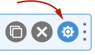
To edit the settings for this field type, click the settings icon on the field itself. Click the Save & Close or Save button to save your changes. If you do not want to save your changes, you can click the Cancel button or click any other form element to close the field settings sidebar.
Basic
The basic tab contains settings that the majority of WS Form users will need to control a field. The settings are as follows:
Label
This label is used to identify the icons field in the WS Form form builder.
Hidden
If checked the field will be hidden on the form. It can be shown again using conditional logic or your own JavaScript.
Repeatable Section
Use this setting to choose which repeatable section the icons will control. If you add an icons field to an existing repeatable section, it will automatically be assigned to that section.
Icons
The icons setting is used to choose which icons are shown in the field.
To add an icon:
- Click the Add icon at the bottom right of the icons repeater.
- In the left column, select the icon type.
- In the right column, enter the ARIA label (accessibility).
- Repeat this process for each icon.
- Click the Save button at the bottom of the sidebar to save your changes.
Accessibility
ARIA Label
Accessible Rich Internet Applications (ARIA) defines ways to make web content and web applications more accessible to people with disabilities.
The ARIA label column enables you to define what text is made available to ARIA applications. This would, for example, provide a screen reader with specific text to read to someone with a disability.
Advanced
The advanced tab contains additional form attribute settings that provide further control over how a field is rendered.
Styles
Use the Styles settings to change the design of the custom button.
Vertical Alignment
The vertical alignment setting allows you to choose how this field will be vertically aligned in relation to fields in the same row. The options are:
- Top
- Middle
- Bottom
Horizontal Alignment
The horizontal alignment setting allows you to choose how the icons are horizontally aligned. The options are:
- Left
- Center
- Right
- Space Around (The space around each icon is the same)
- Space Between (The space between each icon is the same)
- Space Evenly (The space before, between and after each icon is the same)
Icon
Use this setting to choose which style of icon to display:
- Circle (Default)
- Circle – Solid
- Square
- Square – Solid
- Text
- Custom
If Custom is chosen, you can enter your own HTML for each icon. The ARIA Label is automatically wrapped around your HTML.
Size (Pixels)
Enter the size in pixels of the icon (does not apply to text or custom icon styles).
Active Color
Select the color to use if the icon is active.
Disabled Color
Select the color to use if the icon is disabled. Icons are disabled when they cannot be used in a particular row, for example, the Move Up icon is disabled in the first row.
Classes
For developers WS Form allows you to add your own classes to fields.
Field Wrapper
The wrapper CSS class setting enables you to add a class (or classes) to a field wrapper. Field wrappers are sections of HTML added around a field to position them on the page. To add multiple classes, add a space between the class names.
Field
To add a class to the actual field element itself, enter a class (or classes) to this setting. To add multiple classes, add a space between the class names.
Restrictions
Field restrictions enable you to define what can or cannot be entered into the field.
User Status
Choose from one of the options to filter which user status can see this field:
- Any
- Is Logged In
- Is Logged Out
- Has User Role or Capability
If you choose Has User Role or Capability, additional settings will appear that enable you to choose one or more roles or capabilities.
Custom Attributes
This setting is used to add custom attributes to the HTML of this field, such as data-my-attribute="1234". You can add as many custom attributes as you need.
To add a custom attributes key value pair:
- Click the Add icon to add a custom attribute row.
- Enter the key in the left column.
- Enter the value in the right column.
- Click Save to save the custom attributes.
Breakpoints
The breakpoint settings define the width of a field and also what the offset (how many columns from the left-hand side of the form or the previous field) of a field is for each breakpoint. For more information about the breakpoint settings and capabilities of WS Form, click here.