The Summary field automatically creates a live preview of completed field values on your WordPress form. It provides users with a quick and easy way to review their responses before submitting the form.
Demo
Adding a Summary Field
To learn how to add, edit, clone, move, resize, offset, or delete a summary field, please click here.
Field Settings
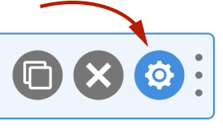
To edit the settings for this field type, click the settings icon on the field itself. Click the Save & Close or Save button to save your changes. If you do not want to save your changes, you can click the Cancel button or click any other form element to close the field settings sidebar.
Basic
The basic tab contains settings that the majority of WS Form users will need to control a field. The settings are as follows:
Label
This is the label shown alongside the field. As well as entering a label into this field, you can also double click the label of the field in the editor. You should enter an easy-to-understand label for your field, for example, Summary.
Show Label
If enabled the label will be shown on your form. If you do not want the label to appear for a particular field, uncheck this box. This setting is unchecked by default for the Summary field.
Hidden
If checked the field will be hidden on the form. It can be shown again using conditional logic or your own JavaScript.
Layout
Field Orientation
Fields can either be oriented in a vertical, horizontal or grid format. Use this setting to determine which orientation you would like the fields to appear in the summary.
If you select grid, you can set a width for each radio at each breakpoint. If you only change the smallest breakpoint, all of the other breakpoints will inherit that width too. This enables you to create multi-column layouts if you have more than one field in your summary.
Label / Value Orientation
This setting determines whether field labels and values are oriented horizontally or vertically.
Headings
Use these settings to determine whether Form, Tab or Section labels are rendered. The options for each heading type are as follows:
- Auto – The label will be shown if a label is present and Show Label is enabled on the form, tab or section.
- Yes – The label will always be shown.
- No – The label will not be shown (Default).
Fields
Hide Empty Fields
If this setting is enabled, the field will only be shown in the summary if it contains a value.
Render Repeaters as Tables
If this setting is enabled, fields contained within repeatable sections will be rendered as a table.
Repeater Row Number Column
If this setting is enabled, a column containing the row number will be added to the table if Render Repeaters as Tables is enabled.
Include Fields
If this setting is left blank, all fields will be included by default. Otherwise, you can specify which fields you would like to include in the summary using this setting. Click the + icon to add a new field.
Exclude Fields
Use this setting to exclude fields on your form from the summary. Click the + icon to add a new field.
The following field types are always excluded:
- Hidden
- Meter
- Progress
- Signature
Advanced
The advanced tab contains additional form attribute settings that provide further control over how a field is rendered.
Styles
Use the Styles settings to change the design of the text area field.
Label Position
There are five positions you can choose from for your label:
- Default
- Top
- Left
- Right
- Bottom
The default position will place the label set in the form settings advanced tab. For new forms this will be the Top positioning.
Note that when using some frameworks some label positions may not be available.
Label Width
If your label position is set to left or right, you can specify how wide the label will be. You can consider the overall width of the label and the field to be 12 columns (or whatever value is set in Form Settings). By default, labels are rendered at 3 columns wide (1/4 width), which means the field itself is 9 columns wide (3/4 width). You can change the width of the label using this setting.
To change the default width of all labels in your form:
1. Click the form settings icon.
2. Click the Advanced tab.
3. Scroll down to Default Label Width and change the setting.
4. Click Save at the bottom.
Vertical Alignment
The vertical alignment option allows you to choose how this field will be vertically aligned in relation to fields in the same row. The options are:
- Top
- Middle
- Bottom
Classes
For developers WS Form allows you to add your own classes to fields.
Field Wrapper
The wrapper CSS class setting enables you to add a class (or classes) to a field wrapper. Field wrappers are sections of HTML added around a field to position them on the page. To add multiple classes, add a space between the class names.
Restrictions
Field restrictions enable you to define what can or cannot be entered into the field.
User Status
Choose from one of the options to filter which user status can see this field:
- Any
- Is Logged In
- Is Logged Out
- Has User Role or Capability
If you choose Has User Role or Capability, additional settings will appear that enable you to choose one or more roles or capabilities.
Custom Attributes
This setting is used to add custom attributes to the HTML of this field, such as data-my-attribute="1234". You can add as many custom attributes as you need.
To add a custom attributes key value pair:
- Click the Add icon to add a custom attribute row.
- Enter the key in the left column.
- Enter the value in the right column.
- Click Save to save the custom attributes.
Breakpoints
The breakpoint settings define the width of a field and also what the offset (how many columns from the left-hand side of the form or the previous field) of a field is for each breakpoint. For more information about the breakpoint settings and capabilities of WS Form, click here.